The river is bright, the willows are full of green, and the person you need to interview is sitting in shade. Lift the whole frame and the water can compete with the face. Add more colour and a turquoise polo shirt or a red kayak may become the loudest thing in the picture. The useful question is not simply “which slider should I move?” It is which part of this shot needs to change, and which parts should stay believable?
Color Mode, the new colour mode in Premiere, reorganises grading around those decisions. It combines a dedicated viewing environment, brightness-based Zones, editable Styles and a system of Operations that can affect a clip, a group of clips or an entire sequence. It is a new grading approach, not simply a different arrangement of the Lumetri panel.
The most noticeable change is the absence of the familiar lift, gamma and gain layout and the conventional point-editing curve interface. The more important change is how the controls, colour management and shared adjustments work together. Understanding that relationship makes the new interface much less mysterious.
This guide takes a riverside promo from the first colour balance to the final output, explaining the new controls, the move from Lumetri, and where log and HDR handling fit into the workflow.
What is Premiere Color Mode, and where is it available?
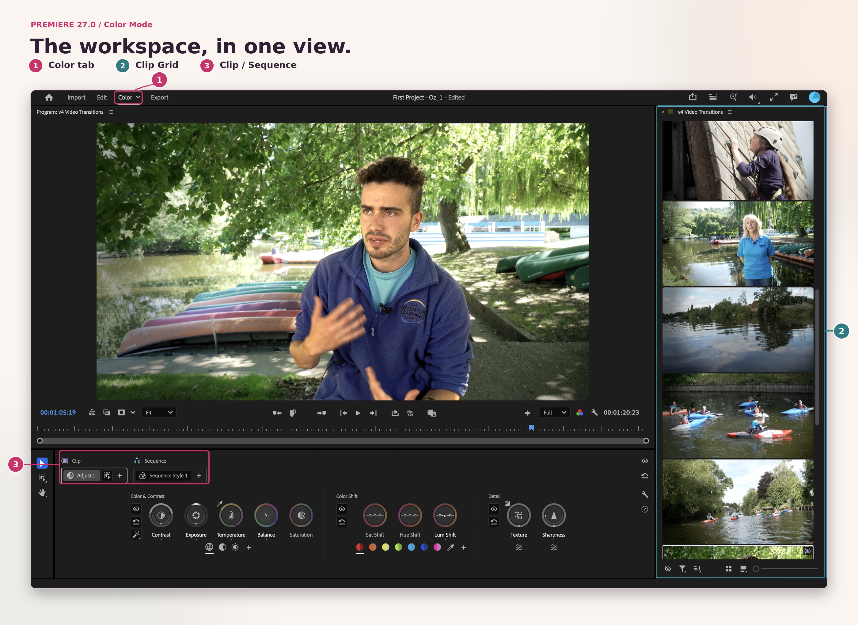
Color Mode arrived in Premiere 27.0 as a dedicated colour-correction and grading environment. Open a sequence, then select the Color tab beside Edit in the application header. Judge the picture in the Color monitor, make your adjustments in Color Controls, and move between shots in the Clip Grid.
It is worth separating three things that are easily confused:
Color Mode: the new environment and grading tools.
Colour management: the transforms that interpret source footage, establish a working colour space and prepare the output.
Lumetri Color: the existing colour effect, which remains available for established projects and workflows.
Color Mode is now available in Premiere. It brings the new grading controls and grade-management system into the application, so you can correct individual shots, organise shared adjustments and develop the overall look alongside your edit.
For learning, use a duplicate project or a fresh practice project with footage you know well. Keep an unchanged copy as a baseline, so you can compare your original work with the new approach and understand what each adjustment contributes.
What actually changes compared with Lumetri?
The old approach centres on a colour effect and its panels: correct the image, work through sections such as curves and colour wheels, then manage how those effects are shared across shots. Color Mode makes the scope of an adjustment a first-class part of the interface.
At the clip level you fix an individual image. At the group level you share a change across related shots. At the sequence level you establish a show look. These are not three different grades you have to build independently; they are levels that contribute to the result.
Task or concept | Traditional Lumetri workflow | New Color Mode | DaVinci Resolve colour workflow |
|---|---|---|---|
Organise corrections | Lumetri Color effect instances, with clip effects and adjustment layers where appropriate | Adjust and Style Operations at clip, custom-group and sequence levels | Node-based grades on the Color page, with grouping and shared correction options |
Shape brightness | Basic correction, curves and tonal colour-wheel adjustments | Global Contrast and Exposure, then overlapping shadow and highlight Zones; Contrast Kit for shaped contrast | Primary wheels, custom curves and HDR grading tools, among other controls |
Change a particular colour | Hue-based curves and secondary controls | Sampled hue swatches with Sat Shift, Hue Shift and Lum Shift controls; masks for spatial isolation | Hue curves, qualifiers and Power Windows, among other tools |
Apply a creative look | Creative adjustments and LUT-based looks where suitable | Editable Style presets built from Modules | Creative node structures, LUTs and grading effects |
Navigate the programme | The editing timeline remains the familiar organising view | Clip Grid for grading navigation, plus Clip and Sequence playback modes | Clip thumbnails and the Color page's grading interface |
Manage colour spaces | Sequence colour-management configuration still matters | Colour-space-aware tools designed to work with the selected managed SDR or HDR pipeline | Colour-managed workflows and colour-space transforms, with SDR and HDR options |
This is a comparison of working methods, not a claim that one application produces better pictures in every situation. Resolve also offers modern HDR and wide-gamut tools; it is not limited to old three-wheel grading. Equally, a good Lumetri grade does not stop being good because a new interface exists.
Our view: the biggest practical gain is fewer disconnected decisions. A scene-level change belongs with that scene. A shot repair belongs with that shot. A creative look remains editable instead of becoming a collection of slightly different copies scattered around the timeline.
Where have lift, gamma, gain and curves gone?
Color Mode does not ask you to begin with three tonal colour wheels or draw points on a conventional curve. Its primary controls begin with the whole image, then let you target brightness ranges through Zones.
This is not the disappearance of tonal shaping. It is a different interface for it. Exposure adjustments within different Zones can shape the relationship between darker and lighter values. The Contrast Kit Module provides an S-curve approach to contrast, while the hue-based Shift controls cover the kinds of changes you might previously have made with Hue vs. Sat, Hue vs. Hue and Hue vs. Lum curves.
What does not transfer directly is the gesture of placing one precise curve point and moving its neighbouring points by hand. Color Mode gives you targeted controls with automatically managed transitions instead. Learn the new method on its own terms rather than looking for a one-to-one replacement for every old dial.
Nor should you translate “lift” into “shadow exposure” and expect identical maths. The useful question is the intended result: do you want to open the darkest areas, lower the black floor, brighten the face, or roll back the brightest clouds? Those are different decisions, even if an older workflow used neighbouring controls to reach them.
How do Zones work?
A Zone is a brightness-defined range of the image, not a drawn region or an identified object. Highlight Zones affect values above a threshold; shadow Zones affect values below one. The transitions blend, and the ranges overlap.
You begin with two automatically analysed Zones: one for shadows and one for highlights. You can add up to three shadow Zones and three highlight Zones, giving six tonal ranges in addition to the Global controls. Additional ranges can be automatically analysed or established by sampling a tonal threshold with the relevant eyedropper.
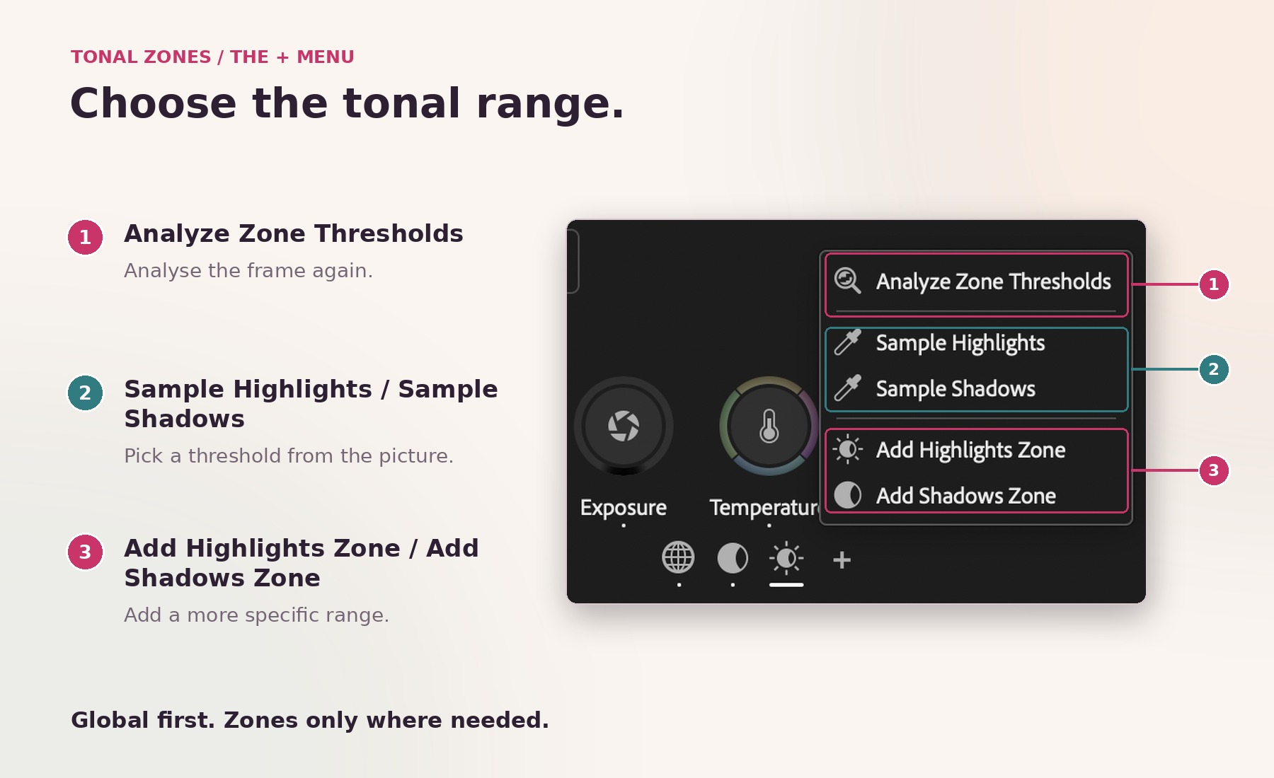
Use Sample Highlights from the + menu beneath Color & Contrast to target the bright river, or Sample Shadows to establish a range for the shaded subject. Choose Analyze Zone Thresholds when you want to analyse the image again. Add another highlight or shadow Zone only when you need a more specific range than the current one provides.
Do not imagine six separate buckets with a hard boundary between each. A more restrictive highlight Zone sits within the broader bright range. Adjusting it and the wider highlight Zone can affect some of the same pixels. The point is finer targeting, not six mutually exclusive selections.
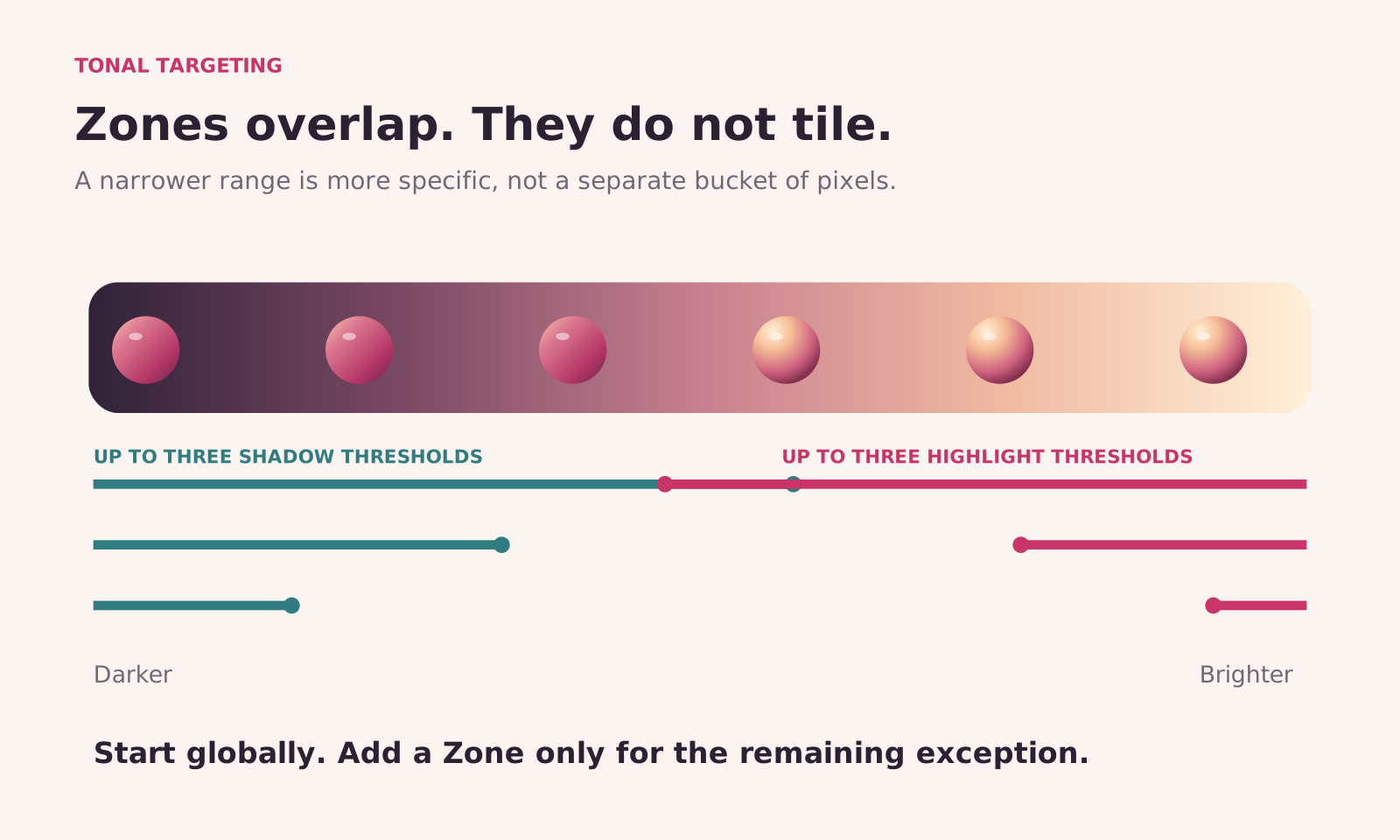
Hover over a Zone button to preview the affected parts of the image. The preview helps you answer a much more useful question than “is this the midtone control?”: does this range include the thing I actually want to change?
Within a selected Zone, you can adjust Exposure, Temperature, Balance and Saturation. Contrast and Black remain global; they are not independent controls inside each Zone.
Use the Exposure waveform to check which bright values fall inside the selected Zone before you move them. A threshold defines a tonal range; it is not a target exposure. Sample each interview on its own rather than copying a number from the sunlit shot to the shaded one.
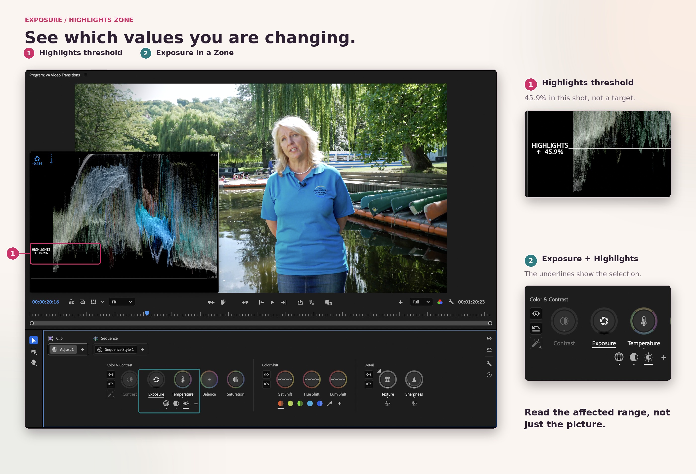
Example: a shaded interview beside bright water
When the interviewee sits in willow shade, resist brightening the entire frame just to help the face. Start with Global Exposure and Contrast to make the person readable. If the background then feels too dominant, use Sample Highlights to establish a relevant highlight threshold and reduce Exposure within that Zone modestly. Watch the face and the red, pink and green kayaks as well as the water.
A highlight Zone cannot know that you mean “river, not face”. If a bright patch on the face and a reflection occupy similar brightness values, both may respond. A narrower threshold can help only when the values separate; an additional masked Clip operation is the route when you need spatial isolation.
The same applies at the dark end. Sample Shadows can help target the shaded subject, but a shadow Zone also includes other dark areas, such as foliage and the navy fleece. It is not an automatic face selection. Adjust only enough to improve separation without making every shaded surface look equally bright.
Why Global comes first
The Global controls establish the image's overall contrast, brightness and colour. Zones are designed to refine that foundation. Trying to rebuild an entirely flat, badly balanced image through six local tonal adjustments creates unnecessary work and makes it harder to understand what each change is doing.
Use this order: make the whole image work; identify the remaining exception; target only that exception. Often the first step is enough. An unused Zone is not a missed opportunity.
How do the new colour controls work?
Start in Color & Contrast to balance the whole image, use Color Shift when one colour needs attention, and turn to Detail for texture and sharpness. Keep overall Saturation separate from Sat Shift: the first changes the whole image, while the second targets a selected hue.
Many controls have two related directions of adjustment. A vertical movement changes the main parameter; a horizontal movement changes its partner. Others, such as Saturation, are one-dimensional, while Balance works as a free-direction colour control.
Click once to latch a control, move the pointer to adjust, then click again to accept and unlatch. You can also click and drag conventionally. With a control latched, the arrow keys provide fine increments. Pressing Return or Escape unlatches the control and accepts the adjustment; Escape is not an instruction to undo the grade.
Control | Main adjustment | Related adjustment | Useful question |
|---|---|---|---|
Contrast | Increase or decrease overall contrast | Horizontal movement changes the pivot | Can I open the bright end without making the shadows too heavy? |
Exposure | Lighten or darken the image | Horizontal movement adjusts Black when working globally | Is the image too dark, or is only the black floor wrong? |
Temperature | Warm or cool the image | Horizontal movement adjusts green–magenta Tint | Is the cast blue/orange, green/magenta, or a mixture? |
Balance | Push the colour balance in a chosen direction | A polar control rather than a separate horizontal slider pair | Does the cast need a direction that Temperature alone does not provide? |
Saturation | Increase or reduce overall colour intensity | No horizontal adjustment | Does the entire image need more colour, or only one hue? |
Sat Shift, Hue Shift and Lum Shift | Change a selected hue's intensity, colour or brightness | Horizontal movement widens or narrows the affected hue range | Can I calm the turquoise shirt without shifting skin or nearby greens? |
Sharpness | Increase or reduce apparent edge sharpness | Horizontal movement changes the threshold | Am I improving useful edges or exaggerating noise? |
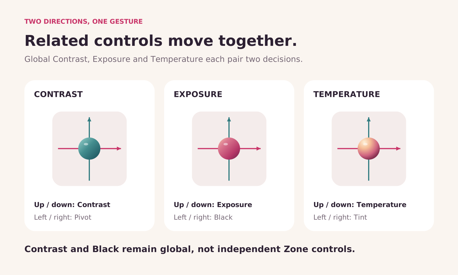
The pivot is particularly useful. Contrast expands or compresses values around it. Moving that pivot changes the balance of what happens above and below it, so you can often reach the desired image with fewer compensating adjustments.
Black sets the minimum signal level used by the Color & Contrast controls in the current operation. Raising it can open the darkest tones; lowering it can make them denser. It is not the same as brightening an entire shadow range.
For precision, hold Shift while moving in the intended direction to constrain a two-dimensional control to that axis. Read the tooltip and watch the HUD rather than assuming every control shares the same horizontal behaviour.
What is the HUD?
The heads-up display appears while you use a control and shows analysis relevant to that adjustment, such as a waveform for luminance changes or a vectorscope for colour changes. Indicators show the affected range and the direction of the adjustment; relevant values appear contextually.
It is feedback, not another look applied to the picture. When you finish adjusting, it can disappear so that you can judge the image without overlays. Hold H to hide it temporarily if it covers a detail you need to see.
Check the finished signal in Video Scopes after balancing the interviews. The HUD explains each adjustment; Video Scopes let you judge the combined grade.
What are Operations, and why do clip, group and sequence levels matter?
An Operation is a managed set of colour adjustments. Select one in Color Controls to see and edit its controls. You can add multiple operations, rename them, change their order, disable them and move them between grade levels.
There are two main types:
Adjust: the correction tools for balancing and refining a shot before or alongside its creative treatment.
Style: a customisable collection of Modules for building a creative look.
Every clip begins with a Clip Adjust operation, normally labelled Adjust 1. A new sequence also has an empty Sequence Style operation, labelled Sequence Style 1, ready for a show look. You do not have to use the empty Style.
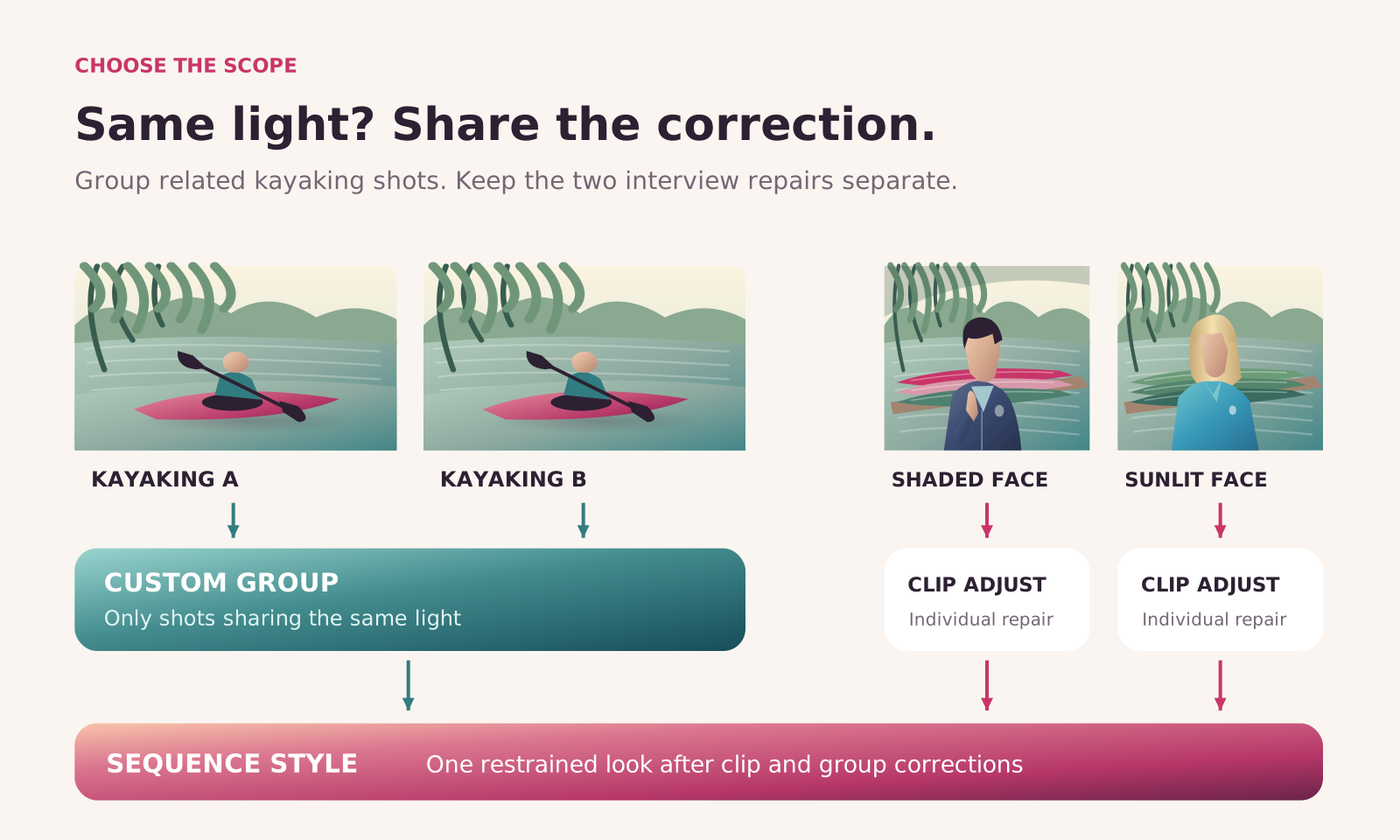
Clip: fix the exception
A Clip operation affects that instance of a clip in the sequence. Use it for the seated interview that needs a different exposure balance from the sunlit standing interview, or for a local repair to one shot. Another appearance of the same source media is not automatically a shared correction simply because it came from the same file.
Custom Group: fix the repeated condition
A Custom Group shares operations across selected clips. In this project, kayaking cutaways recorded in similar light are sensible candidates. Select the genuinely related shots in the Clip Grid, add an operation to the Selection level, then rename the resulting group for the condition it shares.
Changing the shared operation updates the connected clips. That is different from pasting a grade as separate copies: a later revision stays connected. Clips can belong to overlapping groups, so one shot can share a camera correction and a scene treatment while retaining its own clip-level adjustment.
Group by a meaningful condition, not merely by location. “Kayaking, bright river” or “Interview, willow shade” tells you what a shared adjustment is for. “All outdoor clips” could combine the shaded face, sunlit polo shirt and open-water cutaways even though they need different corrections.
Sequence: establish the overall look
Sequence operations act after clip and group colour adjustments and after compositing on the affected tracks. They are the final colour-operation level, making them useful for a programme-wide look.
This has an important consequence: a sequence look can affect composited titles and graphics as well as footage. If the client's logo must stay clean, place the relevant graphics on upper tracks and use the Sequence heading's Set Track Position submenu to establish the boundary. Do not assume a sequence Style automatically recognises brand assets and leaves them alone.
The logo filmed on the navy fleece is different from a title placed on an upper track: it is already part of the interview image and receives that footage’s grade. A sequence track boundary does not isolate an emblem within someone’s clothing. Check it alongside the face and fabric when judging colour changes.
Sequence operations cannot be masked or keyframed. Put a moving, local correction at clip level instead of trying to animate a whole-sequence look around one problematic moment.
Our organising rule: place a change at the broadest level where it is genuinely shared, then use a narrower level for the exceptions. This makes the next revision easier to locate and less likely to disturb something unrelated.
How should you set up colour management for log, SDR and HDR?
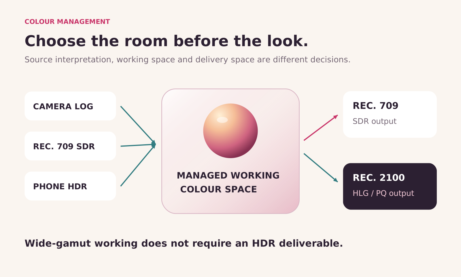
Set the pipeline before the grade. Correctly tagged media lets colour management interpret the source and transform it towards the intended output. Color Mode's controls work with that selected setup; they do not remove the need to choose it correctly.
Three separate questions keep the process clear:
What was recorded? Confirm the source colour space and transfer characteristic, including the correct camera log format or phone HDR interpretation.
Where are you working? Choose the sequence's colour setup and working colour space.
What are you delivering? Establish the output colour space and judge the image on a suitable display.
Direct Rec. 709 (SDR)
Direct Rec. 709 (SDR) is a straightforward starting setup for conventional SDR sequences. Color Mode works in this pipeline too. It is not necessary to deliver HDR merely because you are using the new tools.
For Rec. 709 footage, confirm the interpretation under Use Media Color Space and leave Input LUT at None unless you deliberately need a LUT conversion. Leave Preserve RGB off when you want normal input colour management; it bypasses that processing rather than correcting an image that looks wrong.
For this SDR delivery, choose Direct Rec. 709 (SDR) under Color Setup and set Output Color Space to Rec. 709. Check Working Color Space under Advanced before you begin grading. Some output controls are unavailable when the working and output colour spaces match; that is expected, not a fault in the grade.
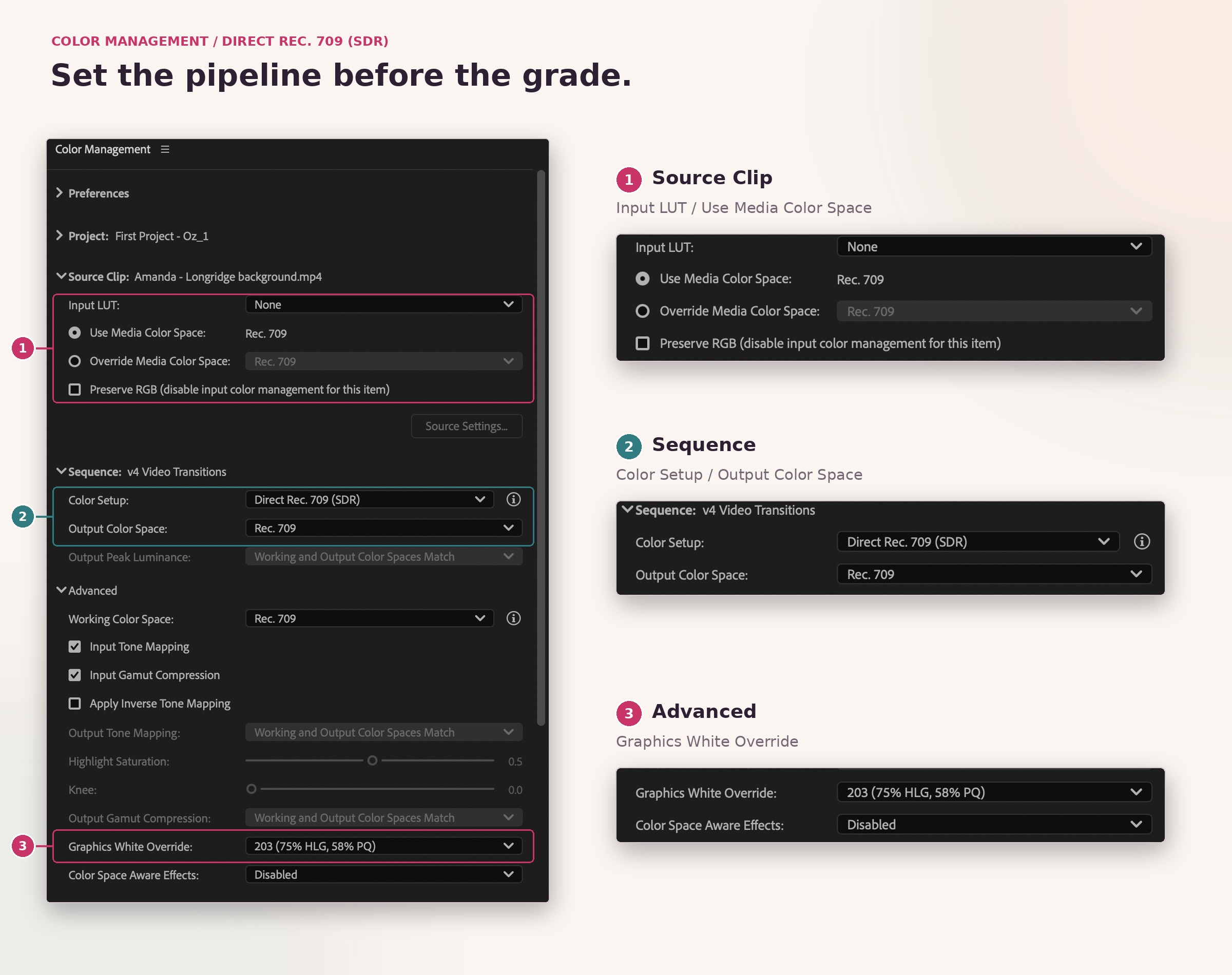
Only change advanced mapping settings when the source-to-output pipeline calls for it. Confirm the delivery format in Output Color Space, rather than inferring it from an HLG or PQ reference elsewhere in the settings. A graphics-white setting does not turn a Rec. 709 output into HDR.
For an ordinary SDR job, the key is consistency: correct source interpretation, the intended sequence setup and matching export colour settings. A phone clip that appears unexpectedly bright or washed out is a reason to inspect the pipeline, not immediately compensate with a dramatic contrast adjustment.
Wide Gamut (Tone Mapped)
Wide Gamut (Tone Mapped) provides a larger working environment with output tone mapping that helps roll highlights and shadows into the display range. That gives contrast and exposure adjustments more room before the final output transform.
A wide-gamut working space and an HDR deliverable are not the same thing. You can work in a wide-gamut pipeline and produce Rec. 709 SDR. Think of the working space as the room in which you make the adjustments, and the output space as the conditions in which the audience will see them.
The improved wide-gamut setup includes inverse tone-mapping and gamut-compression handling for graphics and SDR media in its advanced settings. These matter when a sequence mixes camera log footage with already display-referred images or graphics. They are not a reason to stop checking those elements in the final composite.
Log and raw footage
Log describes how recorded tonal information is encoded; it is not a creative look. A flat-looking log image needs the correct interpretation before you decide whether it needs more contrast. Supported raw media likewise requires appropriate source handling; Color Mode is not a promise that every camera format or raw control behaves identically.
Avoid double conversion. If colour management is already taking correctly interpreted log media into the intended pipeline, adding another technical log-to-Rec. 709 conversion LUT can transform the image twice. A creative LUT also needs a compatible input expectation. Check what a LUT is designed to receive before placing it anywhere in a managed grade.
Do not solve uncertain source tagging by trying several unrelated camera LUTs until one looks attractive. You may create a pleasing single frame while making the rest of the edit much harder to match.
HDR output
For HDR delivery, choose Rec. 2100 HLG or PQ to suit the intended output and monitoring. Color Mode’s controls are designed for both SDR and HDR, rather than assuming that every bright adjustment stops at a conventional SDR white level.
HDR is not a requirement to make everything brighter. Decide which parts of the scene deserve extra highlight range while keeping faces and ordinary surfaces believable. Use appropriate HDR monitoring and inspect the scopes in the correct scale. A brighter laptop display alone is not evidence that your HDR output is correct.
Once grading begins, keep the working colour space stable. Switching setups afterwards can change the appearance of previous adjustments. If you want to compare two pipelines, do that with separate practice sequences or project copies, not by repeatedly changing the foundation under a nearly finished grade.
A complete Premiere Color Mode workflow, step by step
Take a typical riverside promo: two interviews, one in willow shade and one in full sun, plus kayaking B-roll. Same location, very different light. That is where Color Mode earns its keep.
Make a working copy. Keep the original project intact and work on a duplicate. Open the sequence and confirm that the interview and cutaway media is online before adjusting colour.
Set up the SDR delivery. Choose Direct Rec. 709 (SDR) as Color Setup and Rec. 709 as Output Color Space. Check the colour-space interpretation of each source and leave Input LUT at None where no LUT conversion is needed. A bright sky or a flat-looking frame does not tell you that a clip was recorded in log or HDR.
Enter Color Mode and choose a reference. Select Color beside Edit. Begin with one interview, then use the Clip Grid to move between the shots you need to match.
Choose a useful frame of the shaded interview. Pick a frame that lets you judge the face against the sunlit river. Then check several moments of the hand gestures: an adjustment should work through the shot, not just on one flattering still.
Balance the whole shot first. Select Adjust 1 and Global. Use Exposure and Contrast to make the person readable while retaining a believable relationship with the sunlit background. Temperature or Balance can address an unwanted cast; Saturation controls the overall intensity. Do not force the shaded face and bright river to occupy the same tonal range.
Target the bright water where necessary. Open the + menu under Color & Contrast. Use Sample Highlights to establish a relevant threshold, select the highlight Zone, then judge an Exposure adjustment against the water, sky and any bright skin. Sample the two interviews separately: a threshold that suits the sunlit face may be wrong for the shaded one.
Refine the shade only if it still needs help. Use Sample Shadows when the face or fleece needs more separation after the Global correction. Analyze Zone Thresholds is available to analyse the image again; Add Highlights Zone and Add Shadows Zone add further ranges when a broader one includes too much. Compare the result with the unadjusted operation and avoid building unnecessary Zones.
Balance the standing interview separately. Give the sunlit interview its own base correction rather than pasting the grade that opened up the shaded face. Make skin the reference for a credible interview image, then use Comparison View to judge it against the seated interview. Matching means continuity, not making sunlight look like shade.
Control the colours that pull attention away. In Color Shift, sample the turquoise or blue range and use Sat Shift if the shirt becomes too intense. Review red and pink kayaks separately. Hue Shift changes a selected hue and Lum Shift changes its brightness; use them for a specific problem, not just because the controls are available. Watch water, foliage and other objects sharing the selected hue.
Refine the look around the interview. Try Vibrance Higher and Contrast Medium as a starting look, then check whether the extra intensity still suits skin, the shirt and the kayaks. If contrast makes the navy fleece too dense, refine Contrast Kit; if the shadows feel washed out, inspect the treatment in Flare. Judge Midtones changes against the face, not just the water. Edit the relevant module rather than accepting the preset unchanged.
Be restrained with Detail. Texture and Sharpness can make changes obvious in willow leaves, water ripples, hair and clothing. Judge those details alongside the face. A busier background is not automatically a better interview picture.
Share only genuinely repeated corrections. Put kayaking cutaways that share a lighting condition into a Custom Group. Keep a differently lit shot separate if it needs another base correction. Likewise, do not group the two interviews merely because both were filmed outdoors.
Use Sequence Style for the common finish. A restrained Sequence Style can give the edit a coherent treatment after the clip and group corrections. Check the seated face, sunlit face, turquoise shirt, red kayaks and open water through that look. Move a treatment into a Custom Group if it belongs only to one part of the edit.
Play the sequence and export a test. Watch the interview cuts, hand movement, changing reflections and kayaking action. Use Video Scopes as well as the picture. Export a short representative section in the intended Rec. 709 output and inspect it before committing to the whole sequence.
A look-first route can also work: establish a moderate Sequence Style, then balance the individual shots while viewing them through it. The same ordering still matters. Clip and group repairs sit upstream of the sequence look, and a lively overall treatment should not conceal a shaded face or make the polo shirt compete with the interview.
Worked example: match the riverside interviews and kayaking B-roll
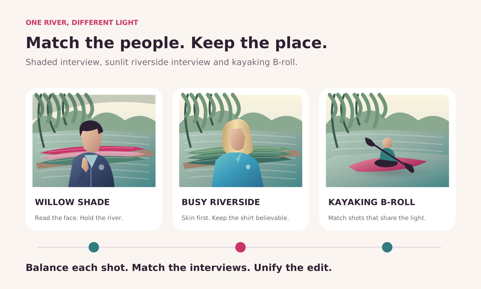
Treat this as a riverside promo in which the interviews lead and the action cutaways supply the energy. The grade needs to keep faces easy to read without taking the life out of the water and colourful boats.
The useful brief is readable faces, believable clothing and a river that feels bright without becoming the main subject of every interview. The kayaking cutaways should belong to the same film, but neither interview needs to be forced into the lighting of the other.
Pass one: separate the exposure problem from the colour pipeline
Set up the promo for Rec. 709 SDR delivery, then confirm each source’s interpretation before grading. For correctly tagged Rec. 709 footage that needs no LUT conversion, leave Input LUT at None. A darker face against a bright river is not, by itself, a reason to add a log-conversion LUT.
For the man under the trees, the subject-to-background difference is an exposure and lighting relationship within the picture. Raising overall Exposure may help the face, but it also moves the bright river. Establish a useful Global balance first, then decide whether a Zone is needed for the remaining difference.
Pass two: make the shaded face readable without flattening the river
Use the face as the main judgement point while checking that the navy fleece retains depth and the small clothing logo remains readable. If the whole shot needs contrast, make that decision globally. If only the bright background needs restraint, sample a highlight threshold and work within that Zone instead of darkening the entire frame.
Before lowering highlight Exposure, check whether the selected range includes bright skin as well as water. A face highlight, bright kayak edge and water reflection may all fall within one tonal range. The tool separates brightness values, not “background” from “interviewee”.
If the dark side still needs attention, Sample Shadows can establish a relevant range. Lift it only enough to reveal useful separation. Opening every shaded willow branch as much as the face can remove the natural depth that explains why the subject is sitting in shade.
Pass three: calm the busy background around the standing interview
A standing interview against a busy riverside needs a different balance: the turquoise shirt and foliage should support the person, not compete for attention. Making every colour more intense can weaken that hierarchy even if the image initially looks more exciting.
Start by balancing the person, then inspect the bright sky and water with a highlight Zone if they dominate. Use Color Shift deliberately: Sat Shift can reduce the intensity of the sampled turquoise range; Hue Shift can correct a hue that is genuinely wrong; Lum Shift can adjust the selected colour’s brightness. None of these recognises “shirt” as an object. Narrow the hue range and watch the water and nearby colours while making the change.
Use the same discipline for red and pink kayaks. If they become too strong under a Style, sample the relevant hue and make a restrained adjustment. Do not pull down the entire image’s Saturation to solve one vivid boat unless the whole shot really is too saturated.
If the willow greens become too insistent, sample that colour range and judge a restrained Sat Shift adjustment. Green canoes may share the selection with the foliage, so watch both. The goal is not a dull riverbank; it is enough separation for the face and voice to lead the interview.
Pass four: match the two interviews without pretending the light is identical
Compare the seated and standing interviews in Comparison View. Judge the credibility of skin, the neutrality of any surfaces you can reasonably compare, and the strength of the background. The navy fleece should still read as a darker garment; the turquoise polo should still read as a brighter one. They are not supposed to land on identical waveform shapes.
Temperature and Balance can address an unwanted colour cast, while Exposure and Contrast establish a compatible tonal treatment. Keep those corrections at clip level when they solve different lighting problems. A shared group correction is useful only for shots that genuinely share the condition it corrects.
Pass five: refine Vibrance Higher and Contrast Medium around the person
Give the kayaking some energy, but do not let the livelier treatment overwhelm the interviews. Check the turquoise shirt, skin, red kayaks and greens together before committing to the extra intensity. A preset has no knowledge of which colour should hold the viewer’s attention.
Open the modules within Contrast Medium to identify which part of the look needs work. Check Contrast Kit and its Compression control while judging tonal separation. Use Flare to refine the shadow character without making the navy fleece look grey. Judge Midtones changes against skin, because an appealing river background is not enough to make the interview work. Compare the operation enabled and disabled; do not assume the whole look must become weaker because one part needs work.
Return to the shaded interview before settling the treatment. A contrast level that gives the sunlit water attractive sparkle can make the navy fleece or shaded face feel too dense. Solve that shot’s base correction separately instead of using a sequence-wide change to repair only one interview.
Pass six: make the kayaking cutaways belong to the same edit
Bring the kayaking into the same visual world as the interviews without flattening the differences in light. Use the interviews as reference points for the overall treatment, then judge the B-roll on its own light. Water can remain bright, foliage can remain rich and colourful boats can remain lively without every cut increasing in intensity.
For kayaking shots with a repeated lighting condition, a Custom Group provides a sensible place for the shared correction. Keep an individual exception at clip level. Use Sequence Style for the restrained treatment that really belongs across the programme, not as a substitute for making the different shots agree first.
Pass seven: check real movement and fine detail
Play through the hand gestures and kayaking action, and watch how the grade holds as reflections change. Check that the face remains readable, bright water does not become distracting, and colour changes hold together as the scene moves.
Finally, judge Texture and Sharpness against both the subject and the background. Extra apparent detail in every willow leaf and water ripple can make an already busy scene harder to watch. The finished grade should help the viewer follow the person and the activity, not advertise how many controls were used.
How are Styles different from LUTs?
A Style is an editable collection of Modules, not merely a fixed colour remapping. A preset can provide a starting look, but the underlying controls remain available. You can change the ingredient responsible for a problem rather than only reducing the strength of the whole treatment.
For example, if the contrast is right but the shadows feel too washed out, inspect the module producing that shadow treatment. If skin is becoming too stylised, look at the relevant colour and protection controls rather than weakening every part of the look together.
Build the base correction in Adjust 1, then add a creative Style where it helps. Judge Contrast Medium on the standing interview by what it does to skin and the turquoise shirt, not just by how lively it makes the river. The operation’s name is not a reason to ignore the individual controls inside it.
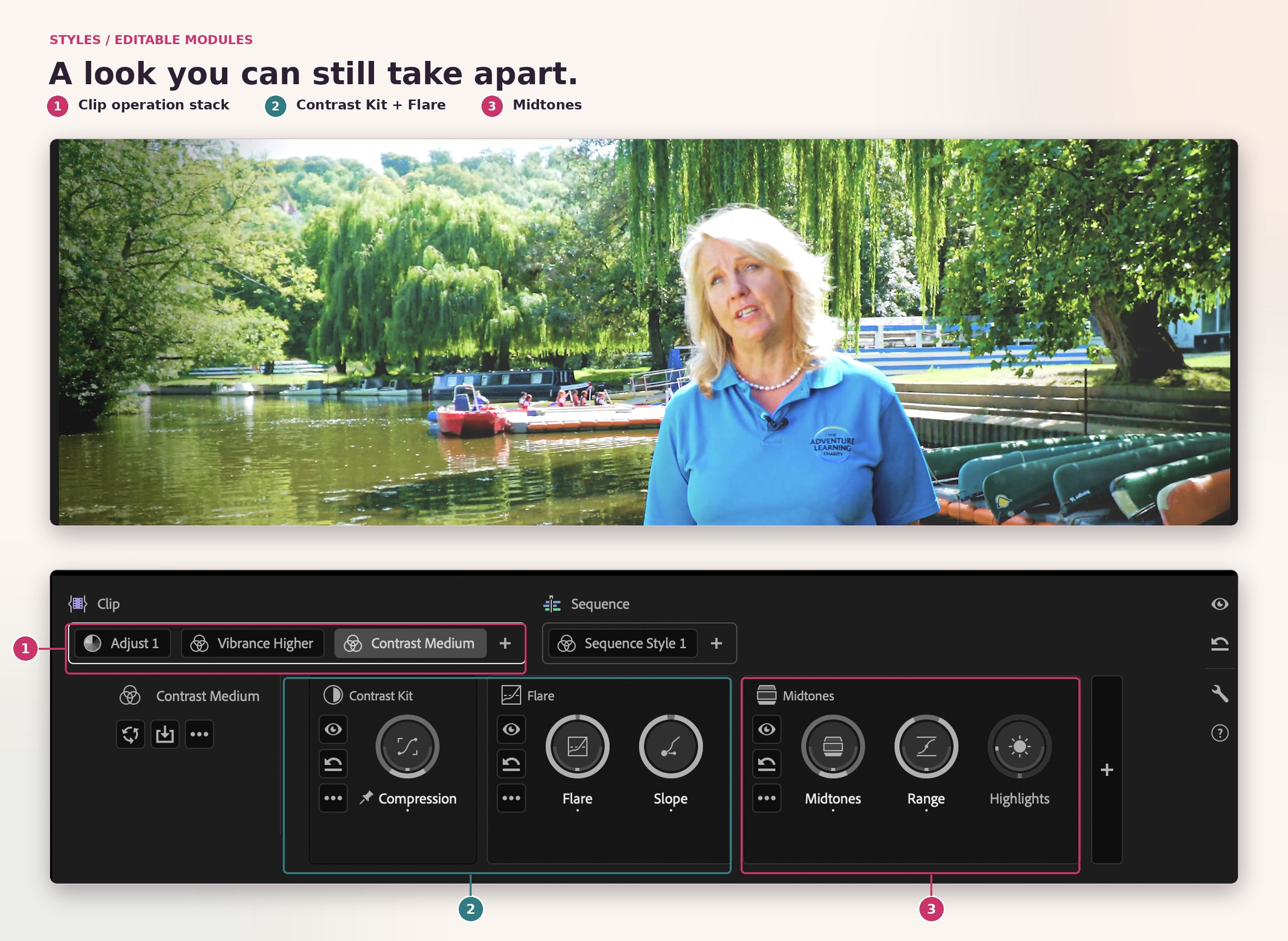
Module | What it is for | What to judge |
|---|---|---|
Color & Contrast | Global and tonal-range colour and brightness work | Whether the overall image and targeted ranges remain believable |
Color Shift | Hue-specific saturation, hue and luminance changes | Other objects sharing the selected hue |
Contrast Kit | S-curve-style contrast with more detailed tonal shaping | Highlight roll-off and separation in dark areas |
Detail | Texture and sharpness adjustments | Noise, ringing and overly processed skin |
Film Color | Combined negative- and print-stock colour and contrast characteristics | Skin, clothing, foliage and the strength of the treatment |
Flare | Shaping the black point and shadow character | Whether opened shadows still have useful depth |
Midtones | Midtone-focused tonal shaping | Whether the selected treatment still suits faces and the surrounding tonal range |
Use Auto Color as a starting correction for temperature and exposure, whether you are working on a clip, a Custom Group or the sequence. It cannot decide how much of the willow shade to preserve, how bright the river should feel, or how far to push the turquoise shirt.
LUTs still have legitimate technical and creative uses. The important distinction is that a LUT does not expose all of the creative decisions behind its colour mapping as separately editable module controls. Know its expected input, understand its purpose and avoid using a technical conversion where colour management has already performed that job.
Can you still use Lumetri and make quick corrections in Edit?
Yes: the Lumetri Color effect remains available, and existing Lumetri adjustments are preserved. Retiring the dedicated Lumetri panel is not the same as deleting the effect or flattening every previous grade.
New and existing Lumetri Color effects remain editable in the Properties panel. When following an older tutorial, distinguish the Lumetri effect from the dedicated Color Mode tools: a change in where controls appear does not mean the old adjustment has vanished.
For a fresh Color Mode exercise, avoid combining Lumetri effects and the new grading system without a deliberate reason. Their processing differs, and some Lumetri adjustments can clip out-of-range values before later operations can use them. This is about preserving flexibility, not about declaring all existing Lumetri work obsolete.
The new Color section of Properties in Edit provides quick global corrections linked to the first Clip Adjust operation. The two-dimensional controls are presented as separate sliders there. You can make an initial temperature, exposure or contrast correction while editing, then continue refining that same starting point in Color Mode.
The previous Lumetri Clip Match function and the old Edit-mode comparison workflow are not the new matching method. Use Color Mode's Comparison View to compare shots and adjust the current clip deliberately. Auto Color and shot matching are also different tasks: individually normalising two clips does not automatically make them match in context.
What hardware and monitoring does Color Mode need?
Plan around the requirements of the installed Premiere build, the media resolution, the effects you use and the display on which you judge the grade. There is no basis for treating Color Mode as an NVIDIA-RTX-only feature.
The published Windows requirements list supported NVIDIA, Intel or AMD graphics with at least 4 GB of GPU memory, with 8 GB recommended. For 4K and higher-resolution media, the recommendation is 32 GB RAM or more. Windows on Arm has its own supported processor and driver requirements, so do not apply the desktop GPU list to it indiscriminately.
Check the operating-system and processor requirements for the Premiere installation you are using, especially before updating an older computer. On Mac, confirm both the supported macOS version and processor type; on Windows, confirm the supported operating system, GPU and driver. A machine that runs an older installation is not automatically suitable for every newer one.
GPU acceleration helps playback, effects processing and rendering, but it cannot make every codec or resolution equally easy to run. An 8K source in an 8K sequence places substantially more demand on the system than an HD exercise. Expanded multi-band Texture adjustments also increase processing demand.
Monitoring deserves equal attention. The Color monitor is where you judge the image; Video Scopes show signal information; an appropriate external display helps you evaluate the intended output. For HDR, use suitable HDR monitoring and the correct output configuration rather than grading a bright-looking picture by eye alone.
Common problems and the first thing to check
Problem | First check | Why it matters |
|---|---|---|
I cannot find the Color tab | Confirm that Premiere is up to date and that a sequence is open | Select Color beside Edit in the application header to enter the grading environment |
My timeline disappeared | Check whether you are in Color Mode; return to Edit for editorial changes | Clip Grid deliberately replaces timeline-based navigation in this environment |
A clip is missing from the grid | Check filters, hidden or disabled tracks and Show Hidden Clips | The grid can conceal clips without removing them from the sequence |
The selected clip will not change | Check that its track is unlocked and that you selected the intended operation | Locked tracks cannot be adjusted, and a selected shared operation may not be the shot-specific one you intended |
I cannot see the clip I selected | Check for a superimposed clip and use the Color monitor's Solo mode for inspection | The selected shot may be underneath another layer in the composite |
A brightness change affects only part of the picture | Check whether a Zone rather than Global is selected | The same controls target different tonal ranges depending on the selected button |
Many shots change at once | Check whether the operation belongs to a Custom Group or Sequence | Shared changes are working as designed, but may be at the wrong level for this repair |
The logo changes with the look | Check the sequence-operation track boundary and graphics placement | Sequence operations affect the composite on the included tracks |
The image is unexpectedly harsh or washed out | Check source interpretation, sequence setup and any conversion LUTs | A pipeline mismatch or duplicate transform should not be repaired with a creative look |
A shirt-colour adjustment also affects water or skin | Inspect the selected hue range and consider a masked Clip operation if the shirt needs spatial isolation | A hue selection is not an object selection |
My old project reports missing colour effects | Check application compatibility and required effects on the computer opening the project | Keep an untouched project copy and resolve missing-effect warnings before saving over existing work |
Test an After Effects hand-off with a short graded section before building the whole workflow around it. Check that the intended colour appearance survives the complete round trip, including graphics and final output. A successful hand-off is something to verify on the actual project, not assume from an unrelated example.
Do not plan around unverified support for a particular grading surface, plug-in, interchange route or newly added module. For a real workflow test, use your own media, graphics and export path rather than a single easy demo shot.
How do you know when the grade is finished?
A shot can look impressive by itself and still be wrong in the sequence. Finish by changing the question from “does this image look good?” to “does this edit hold together?”
Watch the cuts. Compare faces, shared surfaces and similar lighting across adjacent shots. A small jump repeated throughout a film is more distracting than a modestly restrained look.
Watch movement. Inspect faces turning, highlights entering frame and tracked masks crossing detail. A correct still does not prove a stable moving correction.
Watch important colours. Check skin, the navy fleece, the turquoise shirt, red and green boats and any separate upper-track graphics after shared treatments are active.
Inspect the signal. Use the appropriate waveform and colour scopes for the intended output. An intentionally dark scene need not be forced into a full-range graph simply to fill the display.
Inspect the export. Test the actual output format and colour-space settings. If another viewer shows a mismatch, investigate the display and colour-management path before compensating with an arbitrary global gamma change.
The scopes should support a visual decision, not replace it. The aim is not identical graphs for every shot; it is consistent, intentional images delivered through the right pipeline.
What should you learn next?
The interface is new, but the most valuable skills still transfer: recognising an unwanted cast, judging tonal separation, matching shots, protecting important colours and understanding where an adjustment belongs.
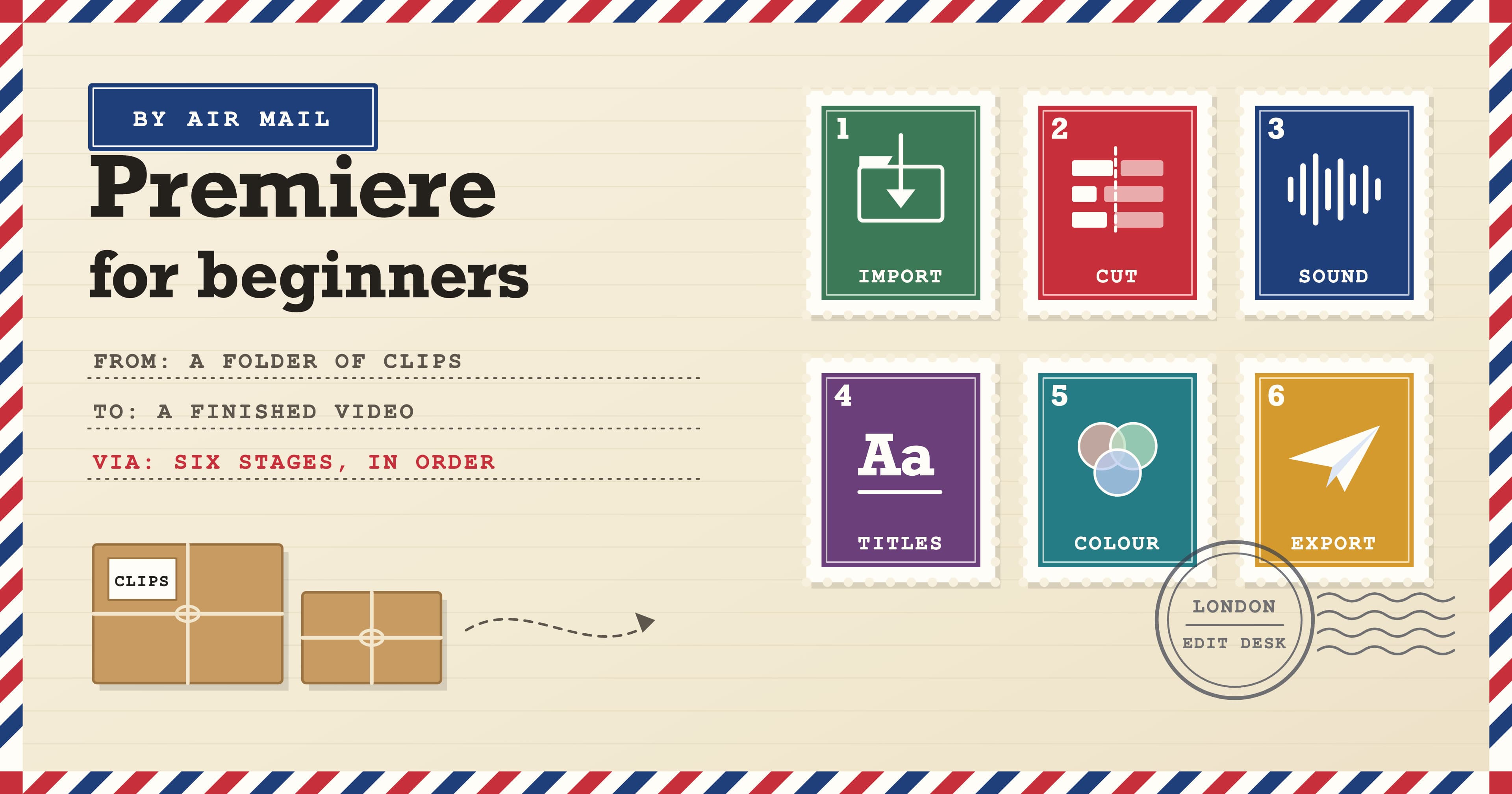
If you are new to editing, our Premiere Beginner course builds the workflow around importing, editing, sound, titles and output. If you already edit and want to strengthen colour correction, masking and more developed workflows, see our Premiere Intermediate course.
For a structured route through those levels, Premiere Fast Track Silver combines Beginner and Intermediate across five training days. Premiere Fast Track Gold adds the Advanced level across eight training days. The Fast Track courses prepare you for the Adobe Certified Professional exam, which can be added as an option.
Docklands Media is an Adobe authorised training partner. We teach the judgement behind the controls as well as the software workflow, so a redesigned panel becomes a new way to apply useful skills rather than a reason to start from zero.
For the wider editing process around a colour pass, revisit our Premiere workflow from import to export.
The habit worth keeping is simple: identify the problem, choose its scope, make the smallest useful change, then watch the edit again. Color Mode gives those decisions a clearer structure. Your eye still decides whether they serve the film.