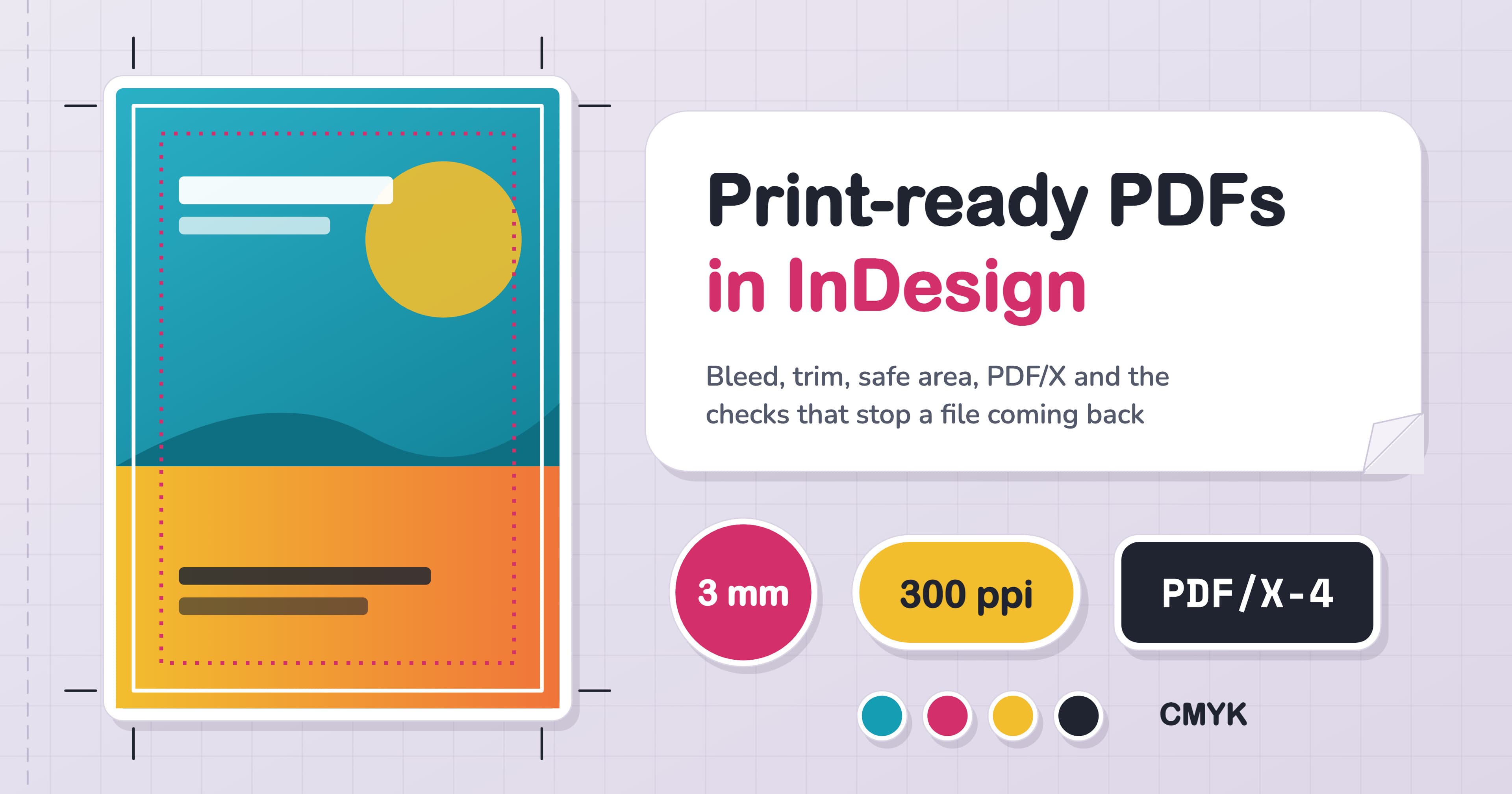
Your leaflet is 148 by 210 mm. The PDF your printer wants is 154 by 216. That extra 3 mm on every side is bleed, and it’s the one thing every UK printer guide we read agreed on. Get it right, along with a handful of other settings, and your file goes straight to press instead of coming back with a polite email asking you to fix it.
Here’s the whole job in one paragraph. In InDesign, set 3 mm bleed in File > Document Setup, run backgrounds and photos out to the bleed line, and keep text and logos at least 5 mm inside the trim. Check every photo is 300 ppi or more at the size it prints, use 100% black for text, and run Preflight until its dot turns green. Then choose File > Export > Adobe PDF (Print), pick the preset your printer asks for (PDF/X-1a:2001 if they don’t name one), tick Use Document Bleed Settings and export pages, not spreads. Below: why each step matters, a worked example and our pre-send checks.
Bleed, trim and safe area: the three lines on every page
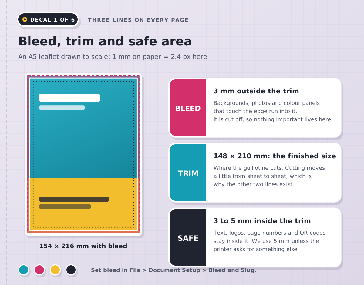
Printers print on bigger sheets and cut them down in stacks, and the blade lands a fraction differently on each sheet. Bleed is artwork that runs 3 mm past the trim, so a cut that drifts outwards still lands on colour rather than a white sliver. The safe area works the other way: a margin inside the trim where nothing important sits, so a cut that drifts inwards never clips a phone number.
Set bleed when you create the document, under Bleed and Slug in the New Document dialog, or later in File > Document Setup. Type 3 mm once with the chain icon on and all four sides follow. A red line appears outside the page edge: pull background frames out to that line, not to the page edge. Set your margins to 5 mm and treat them as the safe area. View > Screen Mode > Bleed shows exactly what the printer will receive; Preview shows the trimmed result.
What do UK printers actually ask for?
We read the artwork guides of ten UK printers and put their rules side by side. They agree on more than you’d expect, and the places where they differ are exactly where files go wrong.
Setting | What we found | What we do |
|---|---|---|
Bleed | All eight that gave a figure ask for 3 mm on standard print; one asks for 5 mm on stickers, signs and banners | 3 mm unless the product page asks for more |
Safe area | 3 mm at two printers, 5 mm at three; more on the spine of bound booklets | 5 mm, which satisfies both |
PDF preset | Three name PDF/X-1a only; two accept PDF/X-1a or PDF/X-4 | Follow the guide; PDF/X-1a:2001 if it’s silent |
Crop marks | Three want them added; two ask you to leave them off | Whatever the guide asks; bleed goes in either way |
Rich black | Three printers, three recipes, from C40 M30 Y30 K100 to C63 M52 Y51 K100 | The printer’s own build |
Ink limit | 280% at one printer, 300% at another | Check in Separations Preview |
Colour and pages | CMYK, with RGB converted if you send it; single pages in reading order, from the two that mention it | CMYK, and export Pages |
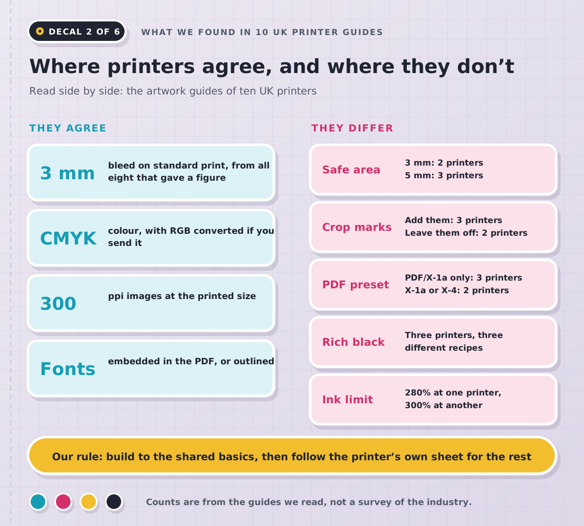
Our takeaway: build every file to the shared basics, which never hurt, then spend two minutes with the spec sheet of the printer you’re actually using for everything else. Those two minutes are far quicker than a proof, a rejection and a resubmit.
Which PDF preset should you choose?
InDesign ships with a preset for every situation, which is why people freeze at the dropdown. Let the printer’s request decide.
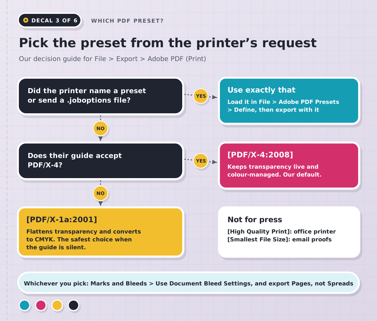
They named a preset or sent a .joboptions file. Load it in File > Adobe PDF Presets > Define and use it exactly as it is.
They accept PDF/X-4. Choose [PDF/X-4:2008]. Transparency, drop shadows and blend modes stay live, and the printer’s own system flattens them at the last moment. It’s our default whenever a printer allows it.
They ask for PDF/X-1a, or don’t say. Choose [PDF/X-1a:2001]. It flattens transparency and converts colour to CMYK as it exports, and almost any press workflow accepts it.
It isn’t going to a press. [High Quality Print] suits an office printer; [Smallest File Size] suits an emailed proof.
Whichever you choose, open Marks and Bleeds and tick Use Document Bleed Settings, and under General choose Pages rather than Spreads. Printers arrange pages on their own press sheets, so a spread only makes them cut your file apart first.
Worked example: a double-sided A5 leaflet
Here’s a typical brief: an A5 event leaflet with a full-bleed photo on the front, a logo from the client and a black back panel with white text. The printer wants 3 mm bleed, CMYK and a PDF, and doesn’t name a preset or mention crop marks.
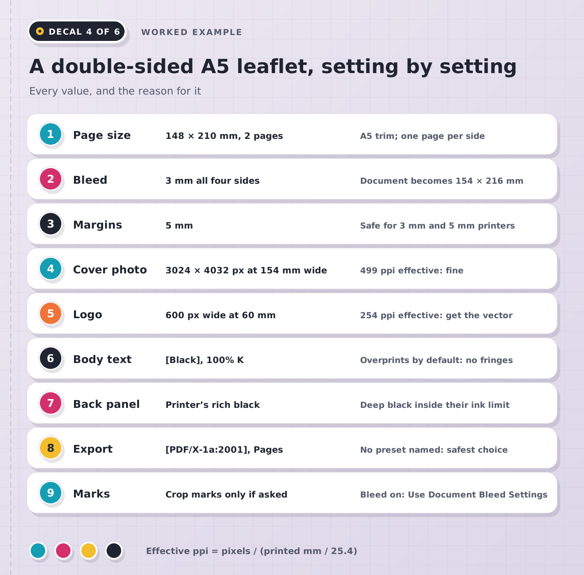
New Document at 148 × 210 mm, two pages, Facing Pages off, because the front and back of a leaflet aren’t a spread.
Bleed 3 mm on every side, so the document now measures 154 × 216 mm in the printer’s terms.
Margins 5 mm, which clears the stricter of the two safe-area rules we found.
The cover photo is a 3024 × 4032 pixel phone shot, placed 154 mm wide so it reaches the bleed. That gives 3024 ÷ (154 ÷ 25.4) = 499 ppi effective, which is plenty.
The logo is a 600-pixel PNG from the client’s website, placed 60 mm wide: 254 ppi. Its edges would print slightly soft, so we ask for the vector version as a PDF, AI, EPS or SVG.
Body text uses the [Black] swatch at 100% K. It overprints by default, so small type never shows a white halo if the plates shift slightly on press.
The back panel uses the printer’s rich black, saved as its own swatch, and the white text on it stays reasonably large so it doesn’t fill in.
Export with [PDF/X-1a:2001], Pages, Use Document Bleed Settings ticked and crop marks off, since the printer didn’t ask for them.
Images, colour and black: where most rejected files go wrong
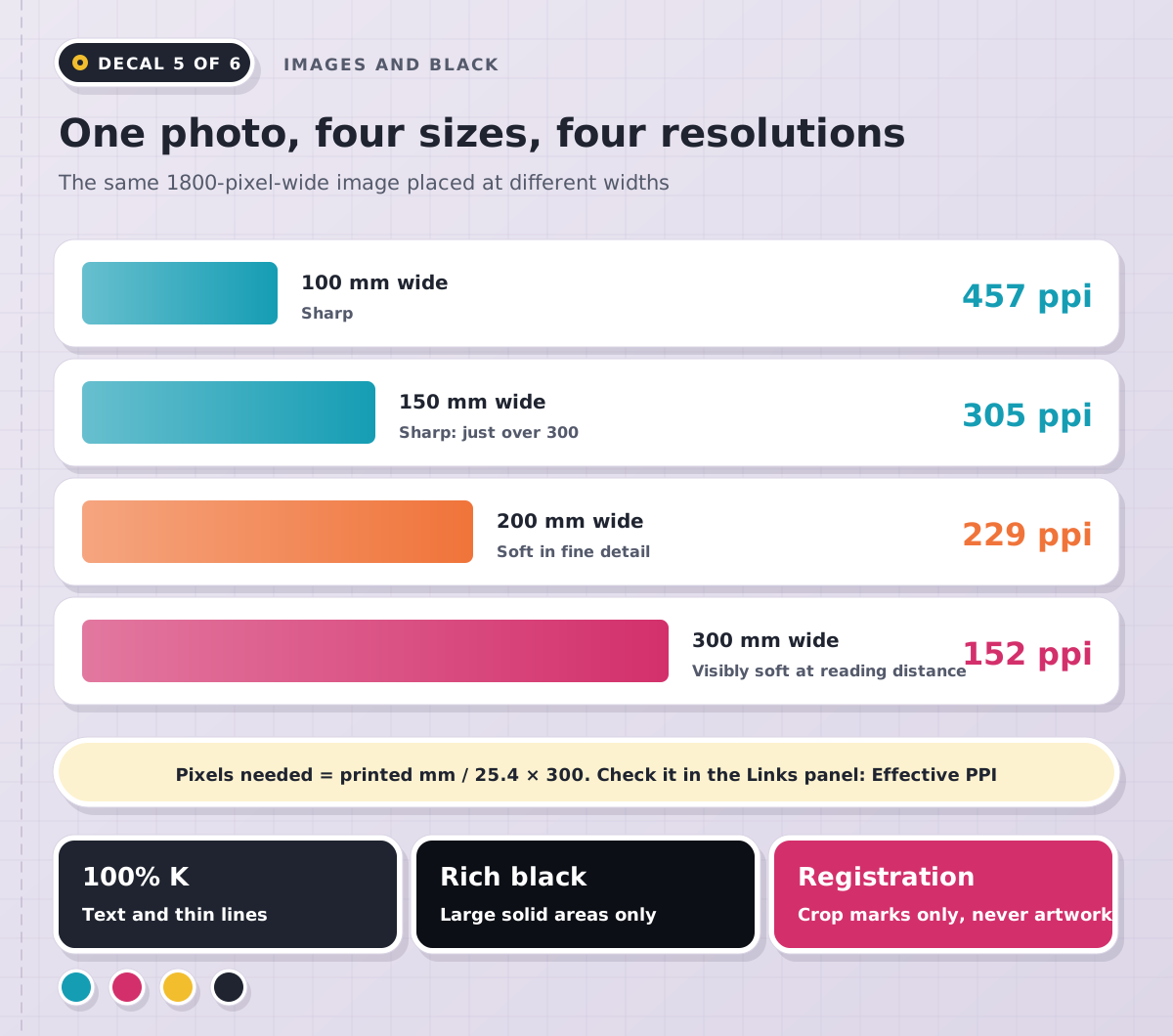
Effective ppi is the resolution of an image at the size you’ve placed it, not the number saved in the file. The Links panel shows Actual PPI and Effective PPI, and the second is the one that counts. The maths is quick: pixels needed = printed width in mm ÷ 25.4 × 300. A photo filling our A5 leaflet including bleed needs about 1,819 × 2,551 pixels.
Colour next. Several printers we read convert RGB to CMYK for you, but bright blues and greens can dull in that conversion; View > Proof Colors previews it on screen. If a brand colour is a Pantone swatch and the job is printing in CMYK, open Ink Manager from the Swatches panel menu and tick All Spots to Process, or the PDF carries an extra plate the printer will query.
Black catches out good designers. Use 100% K, the [Black] swatch, for text and thin lines. Large solid areas in 100% K can look a little grey on paper, which is why printers suggest a rich black, but as the table shows, each has its own recipe. Never use the Registration swatch for artwork: it’s 100% of every ink and belongs on crop marks only. To see total ink, open Window > Output > Separations Preview, set View to Ink Limit and type your printer’s figure; anything over it turns red.
Five print myths that get files sent back
Myth: crop marks are always required. Reality: some printers want them and some ask you to leave them off. Bleed is the part that isn’t optional.
Myth: exporting at 300 ppi makes images sharp. Reality: the export settings only reduce resolution. A photo placed at 150 ppi effective stays at 150.
Myth: spreads make life easier for the printer. Reality: printers want single pages in reading order and arrange them on the sheet themselves.
Myth: if it looks black on screen, it’ll print black. Reality: InDesign can display every black as rich black (Preferences > Appearance of Black), so 100% K and a four-colour black can look identical. Check the swatch values.
Myth: Package is what you send the printer. Reality: Package gathers fonts, linked images and a report into one folder, with an IDML and a PDF if you tick them. Great for archiving, but most printers want just the PDF.
Before you press Send: our eight-check routine
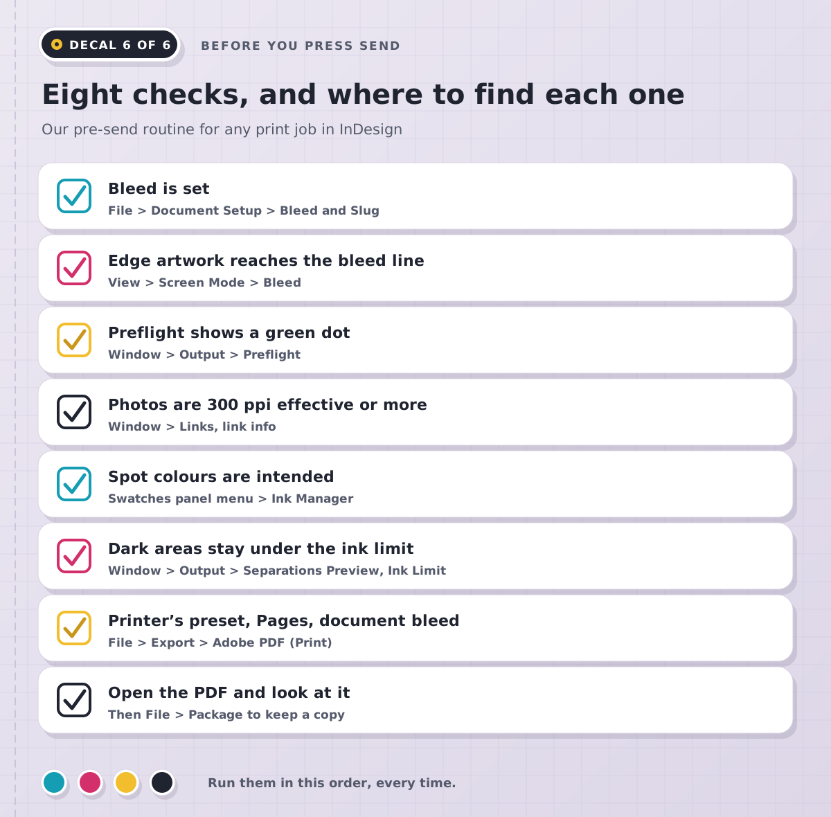
Preflight does a lot of this for you. The dot at the bottom left of the document window turns red when the [Basic] profile finds missing or modified links, missing fonts or overset text; double-click it to see the list. For print work it’s worth building your own profile that also flags images under 300 effective ppi and RGB images. The final check is the simplest and the one most often skipped: open the exported PDF, zoom in and look at every page, edge to edge.
How do you learn print production in InDesign properly?
Print setup runs through all three of our InDesign levels. The two-day InDesign Beginner course covers colour swatches, the Links panel, packaging with fonts and images, and exporting for print and digital. Three days of InDesign Intermediate go further into export formats and compatibility, the Preflight panel and packaging for print, alongside tables, templates and interactive PDFs. InDesign Advanced, also three days, covers custom Preflight profiles and checking files against professional print standards.
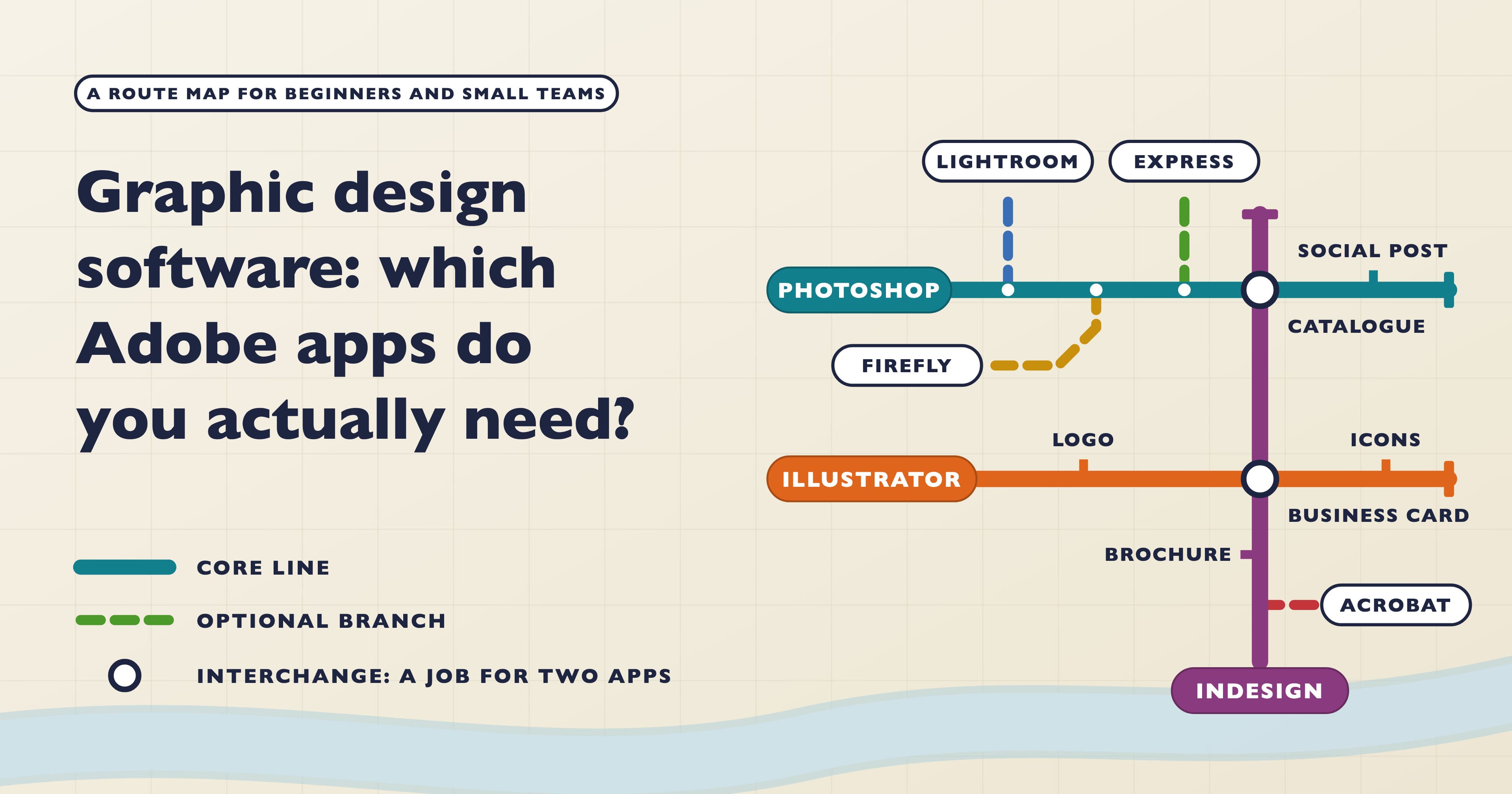
The InDesign Fast Track Silver combines Beginner and Intermediate over five days, and the Fast Track Gold adds Advanced for eight. The Beginner days run back to back and can’t be spread over separate weeks; the Intermediate days follow in the same week or a later one. Both Fast Tracks prepare you to take and pass the Adobe Certified Professional exam in InDesign at the end of the course. If your layouts lean on photos, Photoshop Beginner covers choosing the right colour mode for print and web. Still planning your route? See how long it takes to learn InDesign and which Adobe apps graphic designers actually need.
Learn InDesign with Docklands Media
Docklands Media is an Adobe authorised training partner, and Ozgur, who runs it, is an Adobe Certified Instructor. We’re also authorised by Autodesk, Maxon, Blackmagic Design and Certiport. Courses run in London or live online, and every course ends with a certificate of completion. Bring a real job if you have one: a leaflet due at the printer makes a very good exercise.